Current Resolution: Mobile Breakpoint 991px (991x568)
Website Responsive Checker Tool 2025: The Ultimate Guide
In today's digital landscape, where users access websites from a multitude of devices with varying screen sizes, ensuring your website is responsive is no longer optional---it's essential. Enter the Website Responsive Checker Tool, a vital instrument in every web developer's toolkit. This comprehensive guide will explore the ins and outs of this indispensable tool, helping you optimize your website for all devices and improve your overall user experience.
Responsive Checker: Test Your Website on All Devices
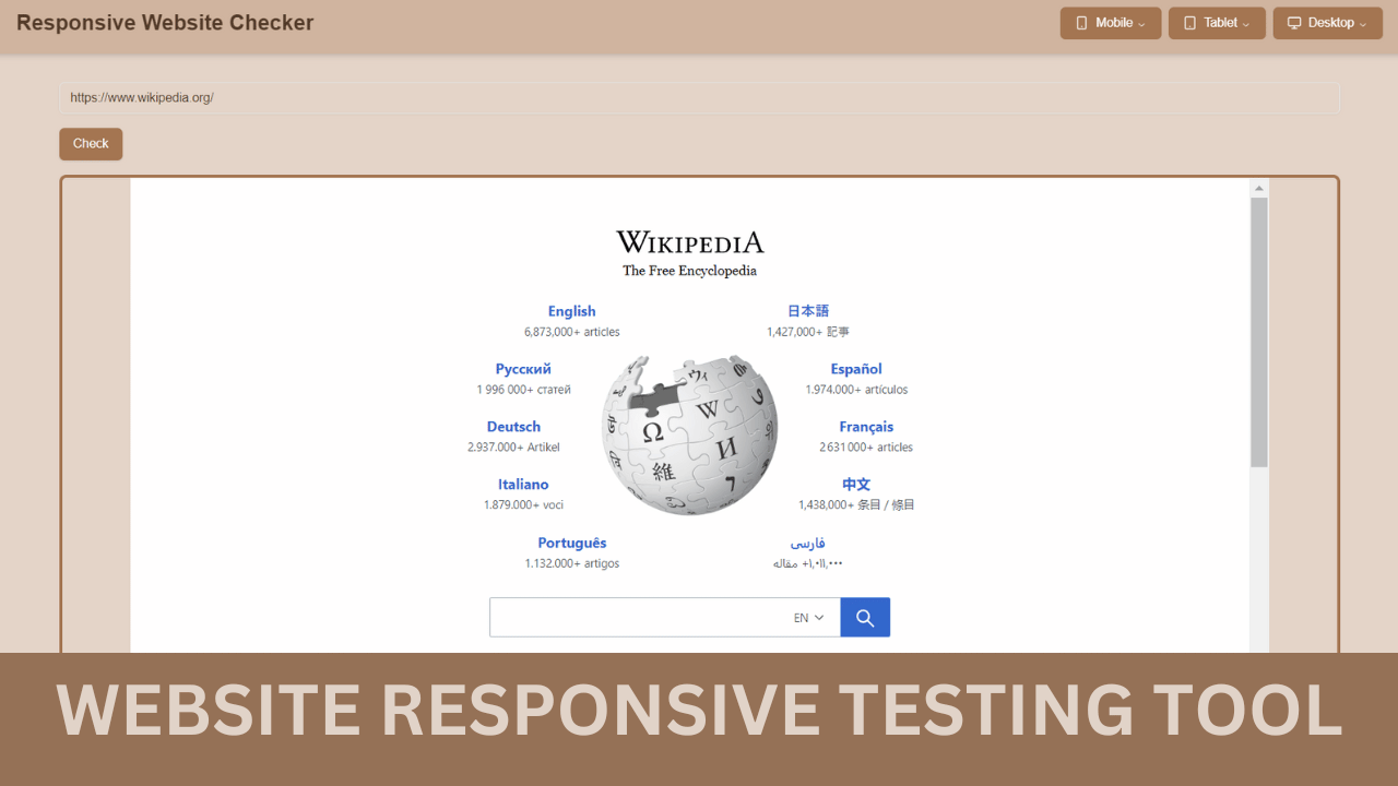
A responsive checker is an essential web development tool that allows you to evaluate how your website performs across a wide range of screen sizes and devices. This online utility helps developers and designers ensure their layout, typography, and interactive elements are visually optimized and functional on desktops, tablets, and mobile phones.
By using a reliable responsive checker tool, you can identify responsiveness issues early and improve user experience (UX), SEO rankings, and accessibility. It simulates various viewport dimensions and resolutions to preview real-time responsiveness without needing physical devices.
If you're also working with media content, try our trustedembed code generator— a powerful tool to create customizable embed codes for websites and apps.
Key Features of Website Responsive Checker Tools
- Multi-device simulation: Emulate various devices and screen sizes to see how your website renders.
- Real-time preview: Instantly view changes as you adjust viewport dimensions.
- Screenshot capabilities: Capture and save images of your website at different resolutions for comparison and documentation.
- CSS inspection: Analyze and modify CSS properties to identify and fix responsive design issues.
- Performance metrics: Some tools provide insights into load times and performance across different devices.
- Cross-browser testing: Check responsiveness across various web browsers to ensure consistent user experience.
- Responsive breakpoint identification: Determine optimal breakpoints for your responsive design.
Advantages of Using a Website Responsive Checker Tool
- Time-efficient testing: Quickly assess your website's responsiveness without physically testing on multiple devices.
- Cost-effective: Eliminate the need to purchase various devices for testing purposes.
- Improved user experience: Ensure your website looks and functions well on all devices, leading to higher user satisfaction.
- SEO benefits: Responsive design is a ranking factor for search engines, potentially improving your website's visibility.
- Bug detection: Identify and fix layout issues before they impact your users.
- Consistent branding: Maintain a cohesive brand image across all devices and screen sizes.
- Accessibility enhancement: Ensure your content is accessible and readable on various devices, improving overall accessibility.
Disadvantages of Website Responsive Checker Tools
- Simulation limitations: While accurate, simulations may not perfectly replicate the experience on actual devices.
- Learning curve: Some tools may require time to master, especially for beginners.
- Potential oversimplification: Relying solely on these tools may lead to overlooking nuanced user experience issues.
- Limited interaction testing: Most tools focus on visual responsiveness and may not fully test complex interactions.
- Performance variability: Simulated performance may differ from real-world scenarios on actual devices.
How to Use a Website Responsive Checker Tool
- Choose a tool: Select a responsive checker tool that suits your needs (e.g., Browser DevTools, Responsinator, or Screenfly).
- Input your website URL: Enter the web address of the site you want to test.
- Select device presets: Choose from predefined device dimensions or set custom viewport sizes.
- Analyze the layout: Examine how your website's elements adapt to different screen sizes.
- Identify issues: Look for problems such as overlapping elements, text readability issues, or broken layouts.
- Make adjustments: Use the tool's features to modify CSS or HTML as needed to resolve responsiveness issues.
- Retest and iterate: Continually check your website as you make changes to ensure optimal responsiveness.
FAQs
Conclusion
By leveraging Website Responsive Checker Tools effectively, you can ensure your website provides an optimal user experience across all devices, potentially boosting your search engine rankings and user engagement. Remember, responsive design is not just about making your site look good---it's about creating a seamless, accessible, and user-friendly experience for all visitors, regardless of the device they're using.